The Dataset
This report represents a summary of results from an empirical, quantitative analysis of observer responses to 15 seascapes and 15 maritime portraits from the collection of the Peabody Essex Museum in Salem, Massachusetts, completed in collaboration with Harvard University.
The majority of this data (unless otherwise specified) is from a series of studies in which participants on Mechanical Turk were invited to explore the image using an online eyetracking proxy called BubbleView. The main two outputs of this study were a set of ‘fixations’ per image (points on the images where participants looked), and aggregate aesthetic ratings per image (one from each participant).
Visualizing Fixations
How can we make sense of how people look at these paintings? To start, we can try and visualize their visual behavior, plotting their fixations on top of the images they’re viewing. Perhaps this is best demonstrated by way of example:
The image I’ll be working with in this example is Nielsen’s Aftenstemning sur Havet.

Here is the overall heatmap for this image, using the viridis colorscale. The more fixations, the brighter the cloud of points:

3D Fixation Visualization
The following is a combination of a 2D density plot and a heatmap. It is meant to show in volumetric form the pattern of fixations across the image. Notice the peak in density of fixations around the boat, one of the few spots of high contrast in the image and the few foci of semantic interest. (Note: This is an interactive plot, so you can rotate it to whatever you feel is the optimal view.)
Regions of Interest Analysis
So far, we’ve seen how we can analyze broad patterns of viewing behavior across entire images. But what if wanted to understand viewing behavior in specific subregions of the image. This is often called a “region of interests” (ROI) analysis. Regions of interest can be defined by theory (the bow of a ship should attract more attention than the stern) or by data (areas of high contrast, in general, tend to attract the eye more than areas of low contrast). The first step in any regions of interest analysis is first to simply count the number of fixations in that region. We can then gather additional data, such as when, on average, a viewer fixated that part of the image.
One way we can tell whether regions of interest are actually interesting is by assessing how many fixations that region of the image attracted relative to the rest of the image (controlling, of course, for the size of the subsetted region within the larger image).
The image and data frame below show the kinds of information this type of analysis yields. fixation_increase is the increase (if greater than 1) or decrease (if less than 1) in the density of fixations relative to the canvas at large; avg_time_of_fixation is the average order in which the observer fixated in that ROI (the higher the number, the later they fixated that ROI on average).
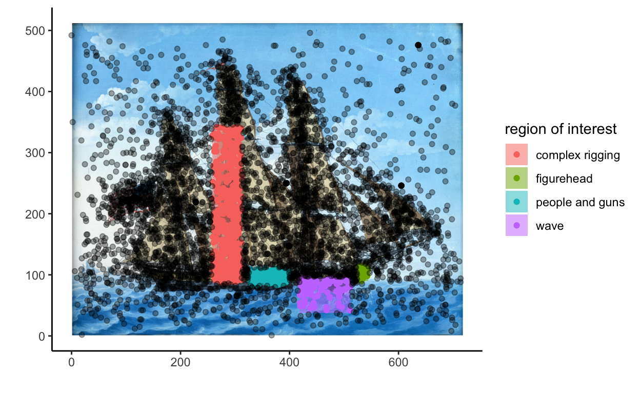
| artwork_title | roi_index | roi_description | fixation_increase | avg_time_of_fixation |
|---|---|---|---|---|
| M1018 | 1 | complex rigging | 2.492783 | 9.674419 |
| M1018 | 2 | people and guns | 4.305657 | 12.064103 |
| M1018 | 3 | wave | 1.350922 | 16.802817 |
| M1018 | 4 | figurehead | 3.109641 | 23.090909 |